Release Notes 2020-02-09
Note: This release focuses particularly in cafelatte related changes.
As you know, cafelatte is the main front-end application of DECAF for end-users.
Over the last month, we have been working extensively on cafelatte infrastructure. Behind the scenes, we have been and still improving and modernising cafelatte application. We are targeting to make cafelatte smarter, slicker and more comfortable to work with over the next few months. This release is where we start harvesting some fruits of this work.
Your feedback and critisizm is greatly appreciated. Please tell us what you think that can be improved.
Main Navigation (Menu) Bar
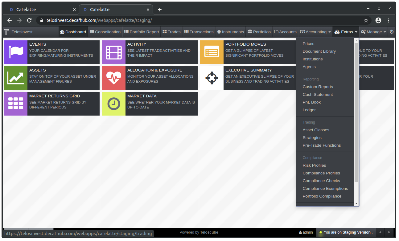
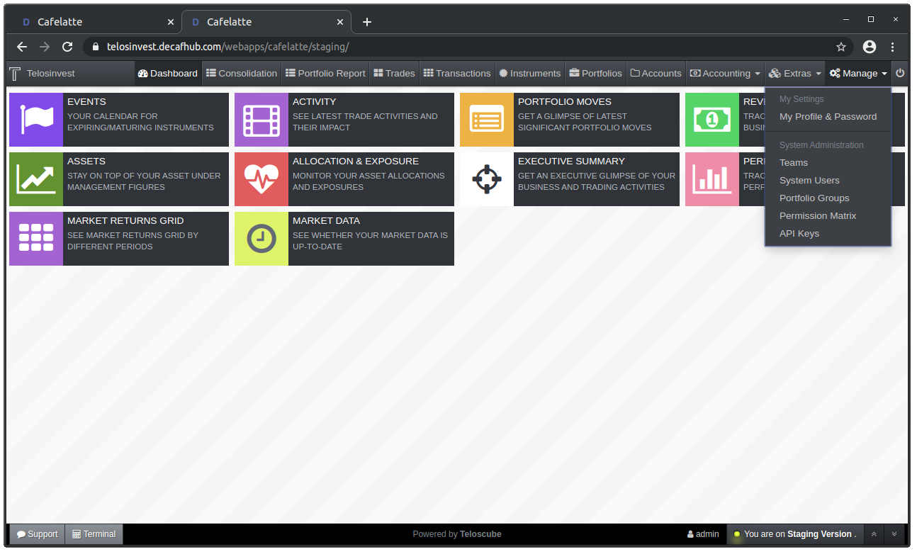
We have revamped the entire navigation bar: Menu items are grouped in logical categories.
Most importantly, we are providing now full customisation option to organisations in case that organisations are not happy with our categorisation. Please get in touch with us if you want to customise the menu categorisation.
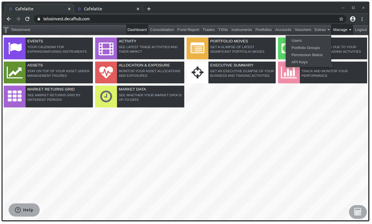
Main Navigation (Before):
Extras
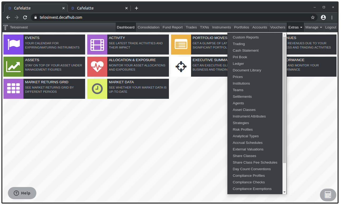
Admin Management
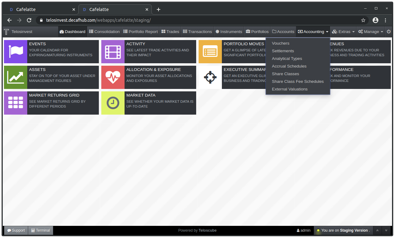
Main Navigation (After):
Extras
Settings Management and Administration
Accounting
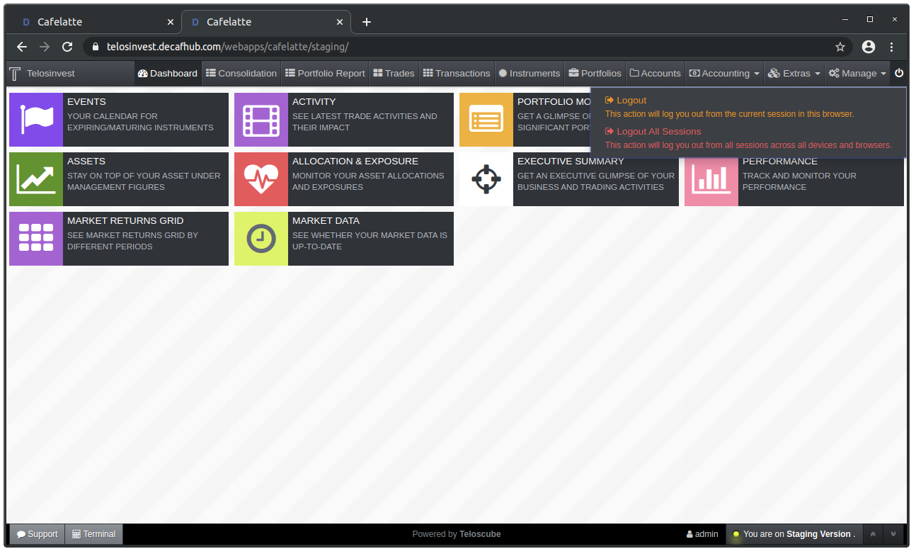
Logout
A New Toolbar on the Footer
We have introduced a new toolbar at the bottom of the page. This toolbar will provide quick access to helper functions and auxiliary information.
Please see below for new and improved functions on this toolbar.

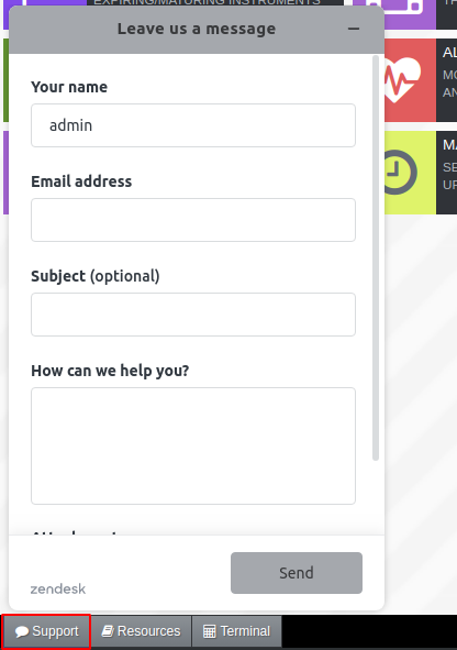
Support/Help Button
The "Help" button is renamed to "Support". The functionality is same as before.
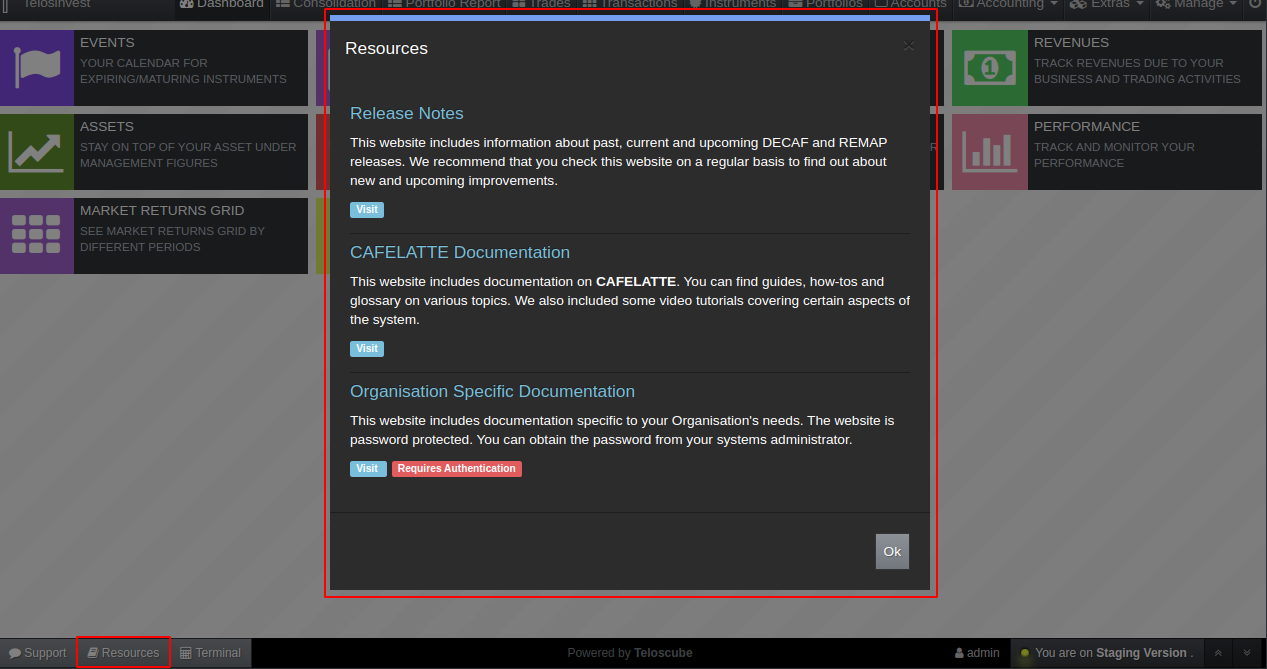
Footer Toolbar for Helper Functions: Help Resources
We are actively working on compiling and presenting material which will support you when needed.
The "Resources" button on the footer toolbar shows you such available resources.
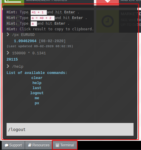
Improve Footer Toolbar Function: Terminal
We have re-located and re-styled our terminal widget. Although this widget was originally designed to provide a quick arithetic calculator, we have extended it to perform several other functions.
We know that it sounds too geek, but it is a useful tool for power-users.
We are planning to introduce more functionality inside the terminal widget in the upcoming releases.
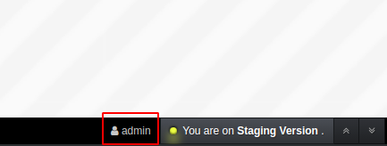
New Footer Toolbar Function: See Information about Currently Logged-In User
Now, we display the currently logged in user on the footer toolbar. This can be useful for shared computer environments.
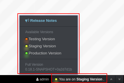
New Footer Toolbar Function: Switch Between Versions
This is one of the most significant features of this release!
We are now offering 3 different versions of cafelatte:
- Production Version: This is default and latest official release for all our users.
- Staging Version: This is the upcoming release for those who are interested to see our progress in the kitchen. This release is automated: If our internal tests are passed, every accepted change is deployed to this version automatically.
- Testing Version: This is similar to staging version, but tests are not completed. It is helpful for changes which we want our users to test and give us feedback before we push them to staging.
In addition to these, you can always reach current and upcoming release notes by clicking on the "Release Notes" link.
New Footer Toolbar Function: Scroll to Top/Bottom of the Page
Some pages are too long!
These two small buttons are available on all pages and they help you to scroll to top or to bottom when you click on them.
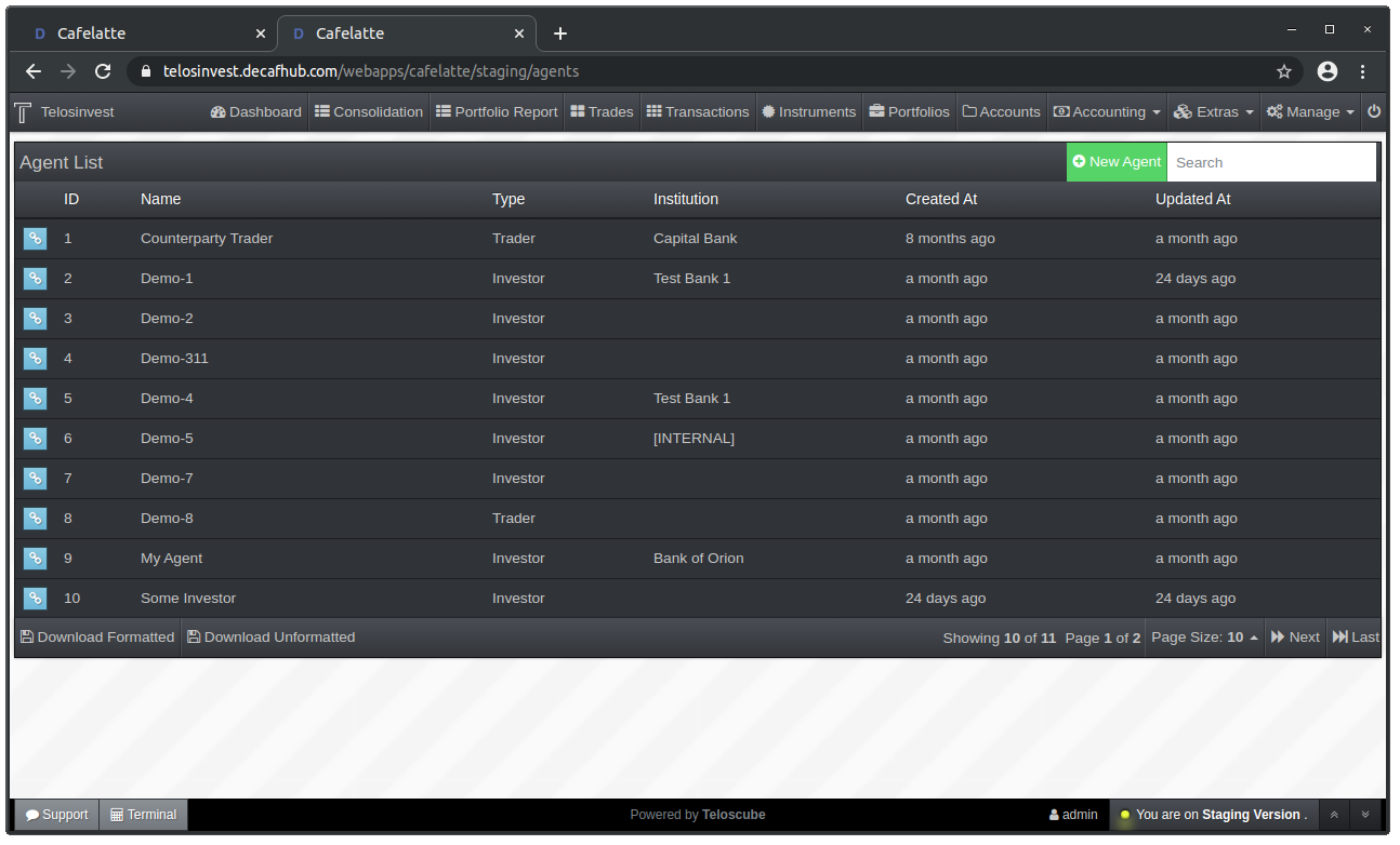
Agent List and Detail Changes
Agent List (Before):
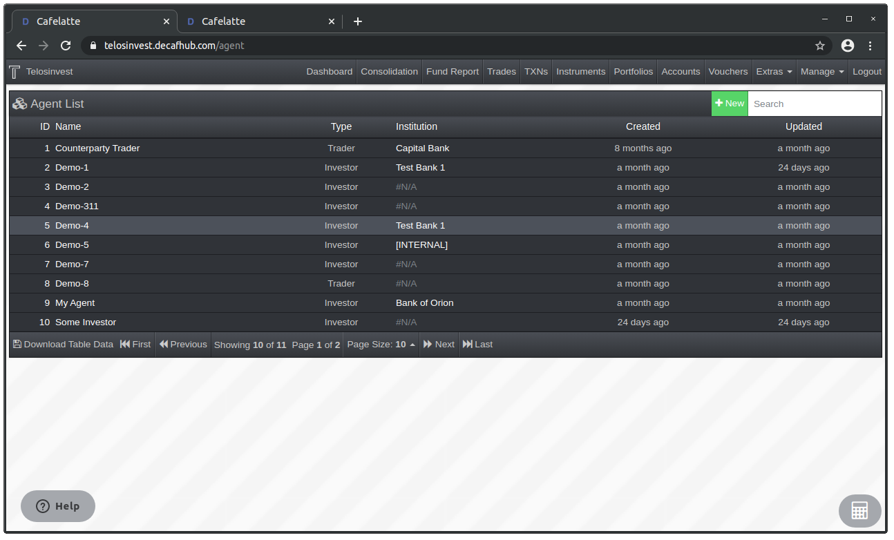
Agent List (After):
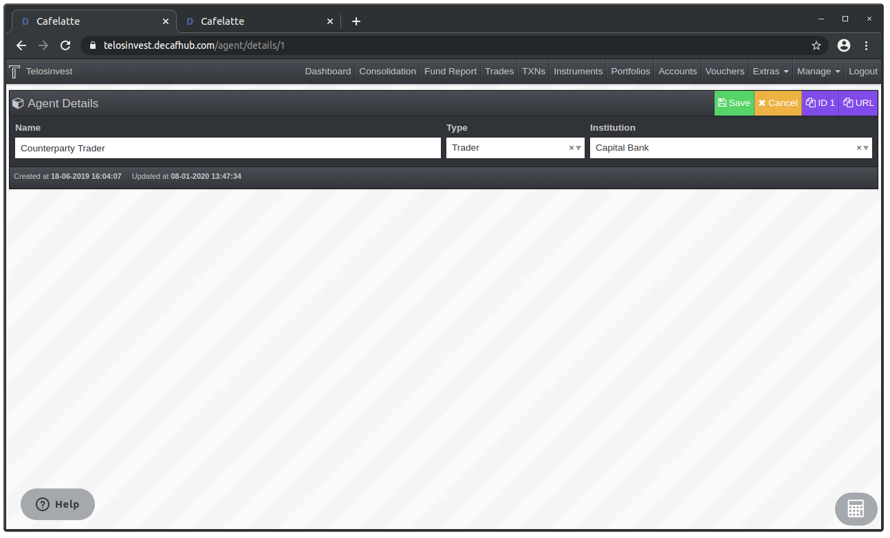
Agent Details (Before):
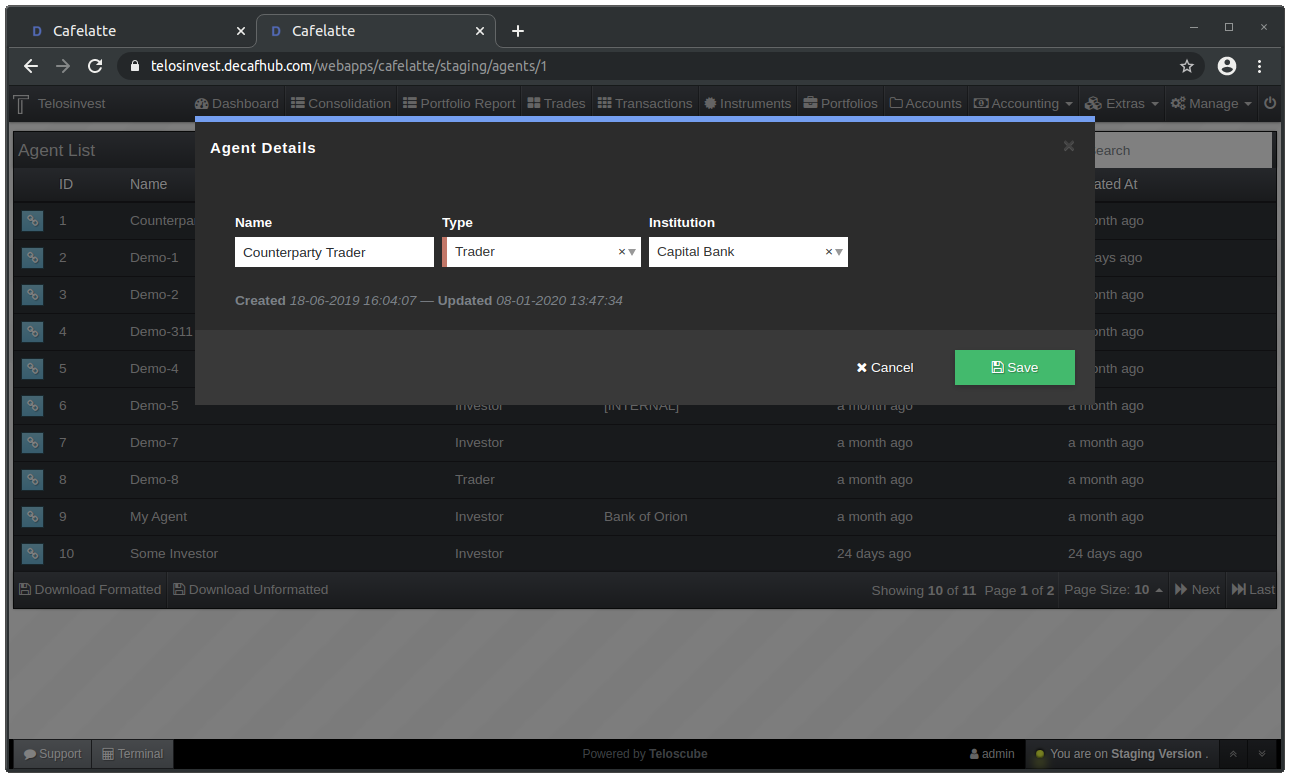
Agent Details (After):
Institution List and Detail Improvements
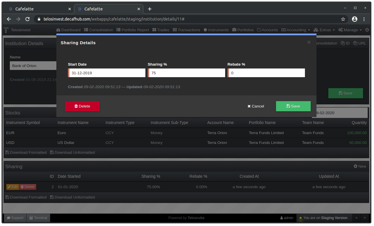
Note the form layout.
Going forward, we will standardise forms as such. We can always make better, but the form actions will always follow the same blueprint:
- Put "Delete" buttom to left.
- Put "Save" and "Cancel" buttons to the right.
- Make default action button filled ("Save" in this case), and the auxiliary action button vanilla.
- Try to find and use a meaningful icon for such buttons.
Institution List (Before):
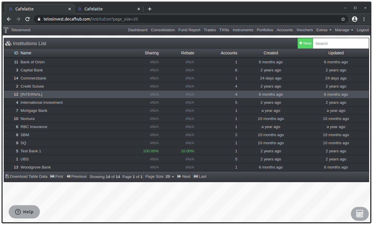
Institution List (After):
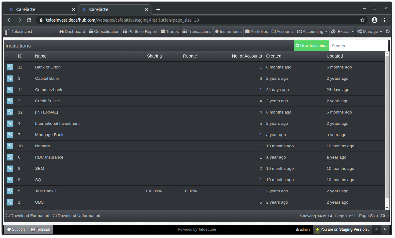
Institution Details (Before):
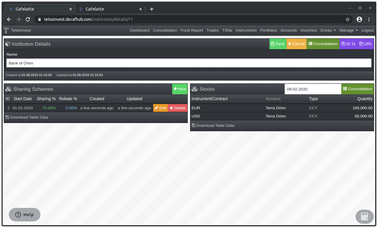
Institution Details (After):
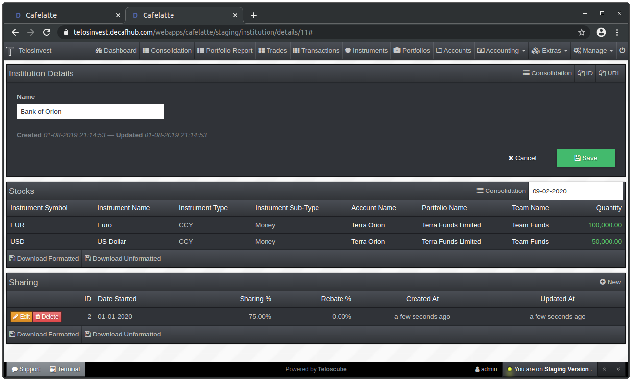
Institution Sharing Scheme Details (Before):
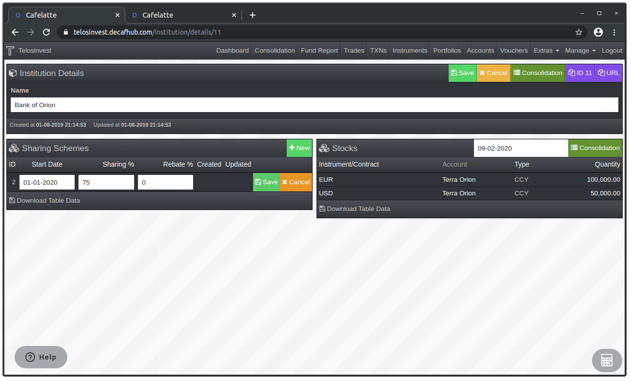
Institution Sharing Scheme Details (After):
More Resilient Instrument Copy Function
"Copy Instrument/Contract" function on instrument details page now copies all relevant information. Furthermore, the new instrument form opens in the same browser tab instead of a new browser tab after clicking the copy button, which makes the operation instantanous.
Portfolio Details Page Improvements
Portfolio Details (Before):
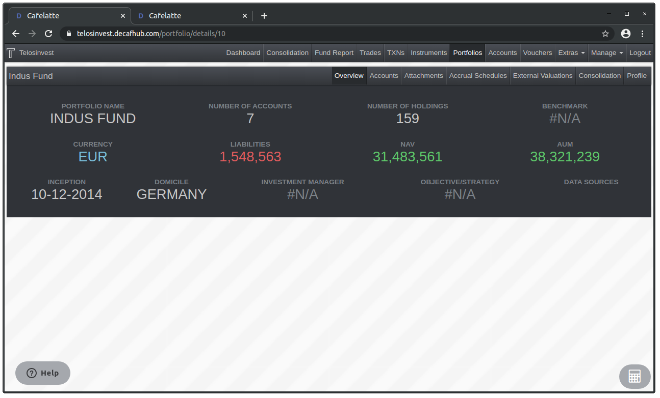
Portfolio Details (After):
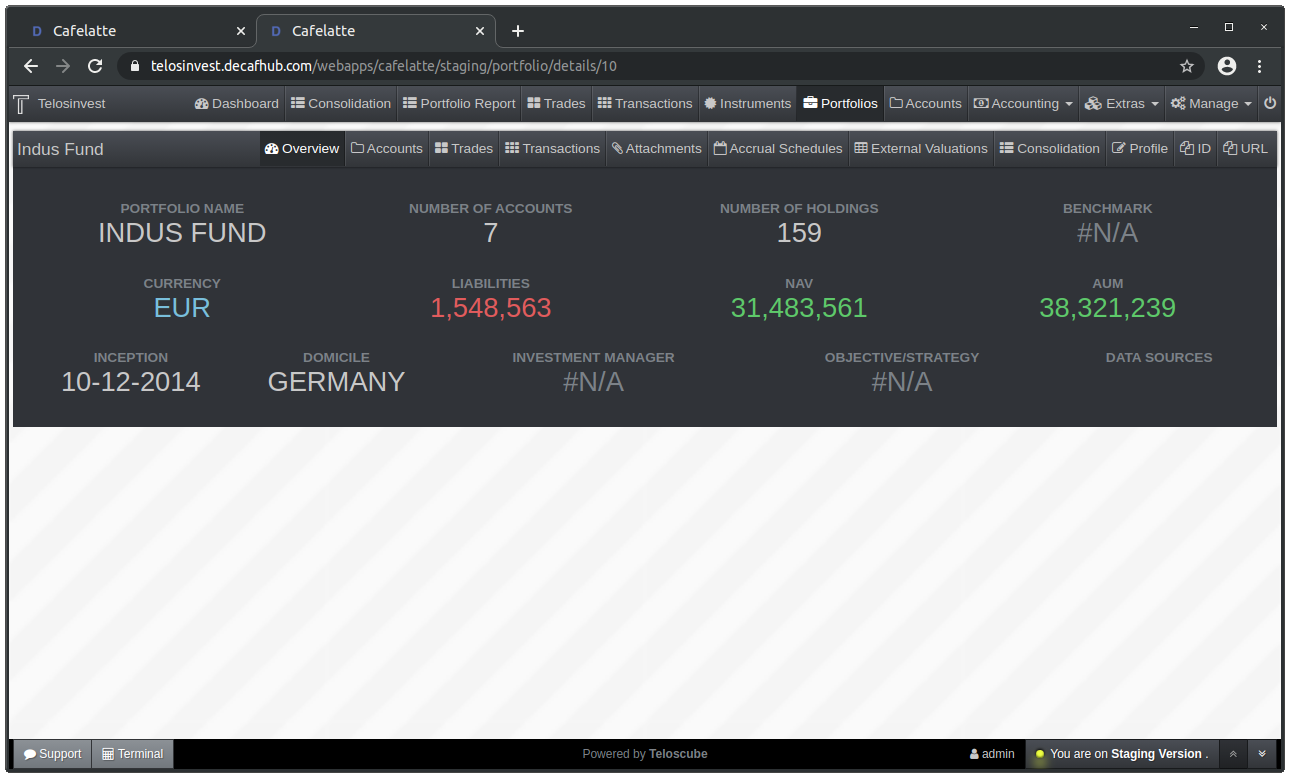
Portfolio Details Account List (Before):
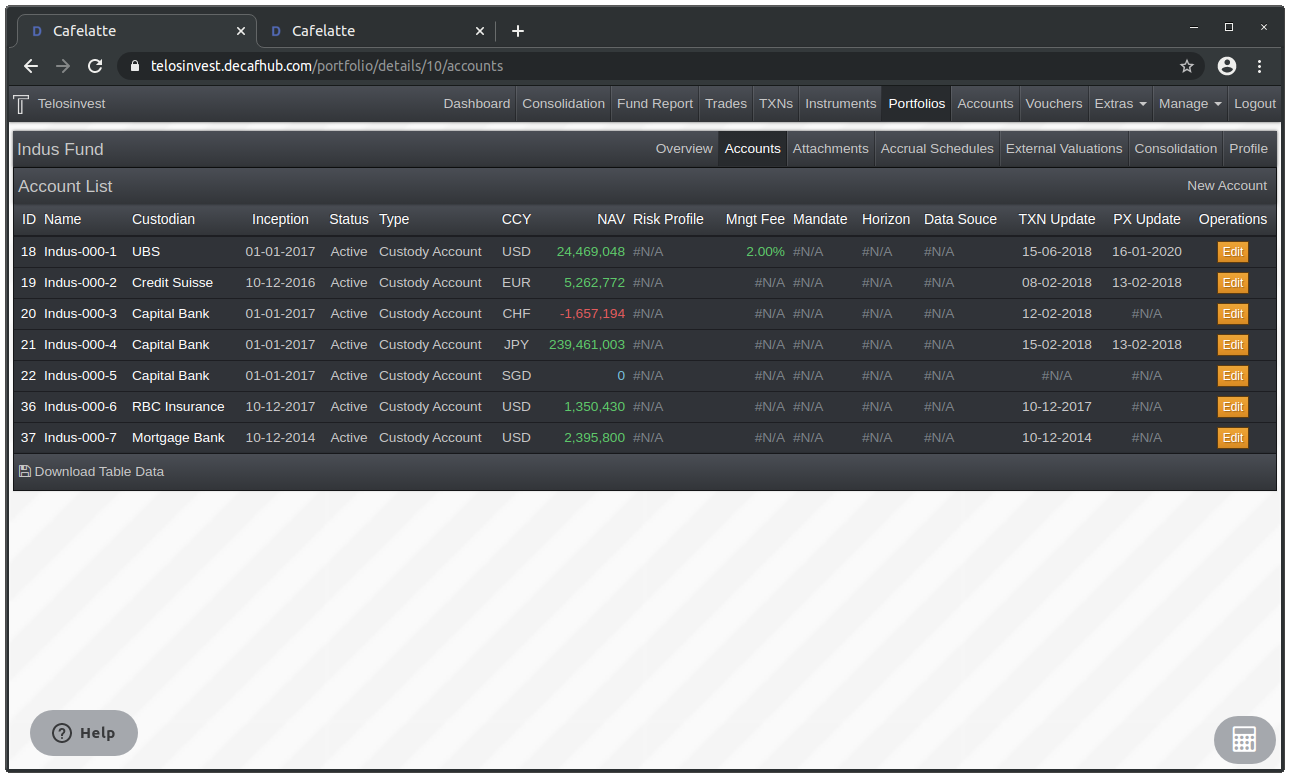
Portfolio Details Account List (After):
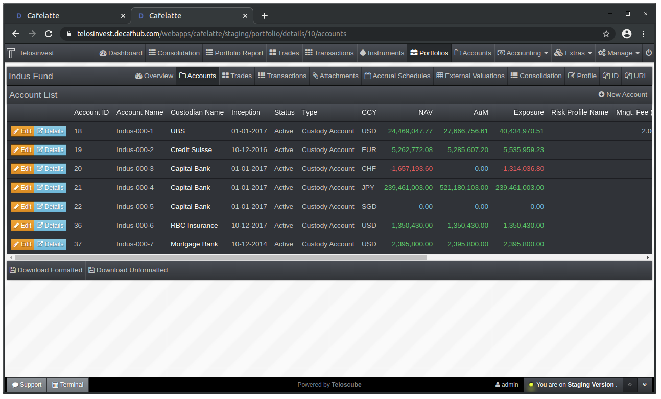
Portfolio Details Account Profile Form (Before):
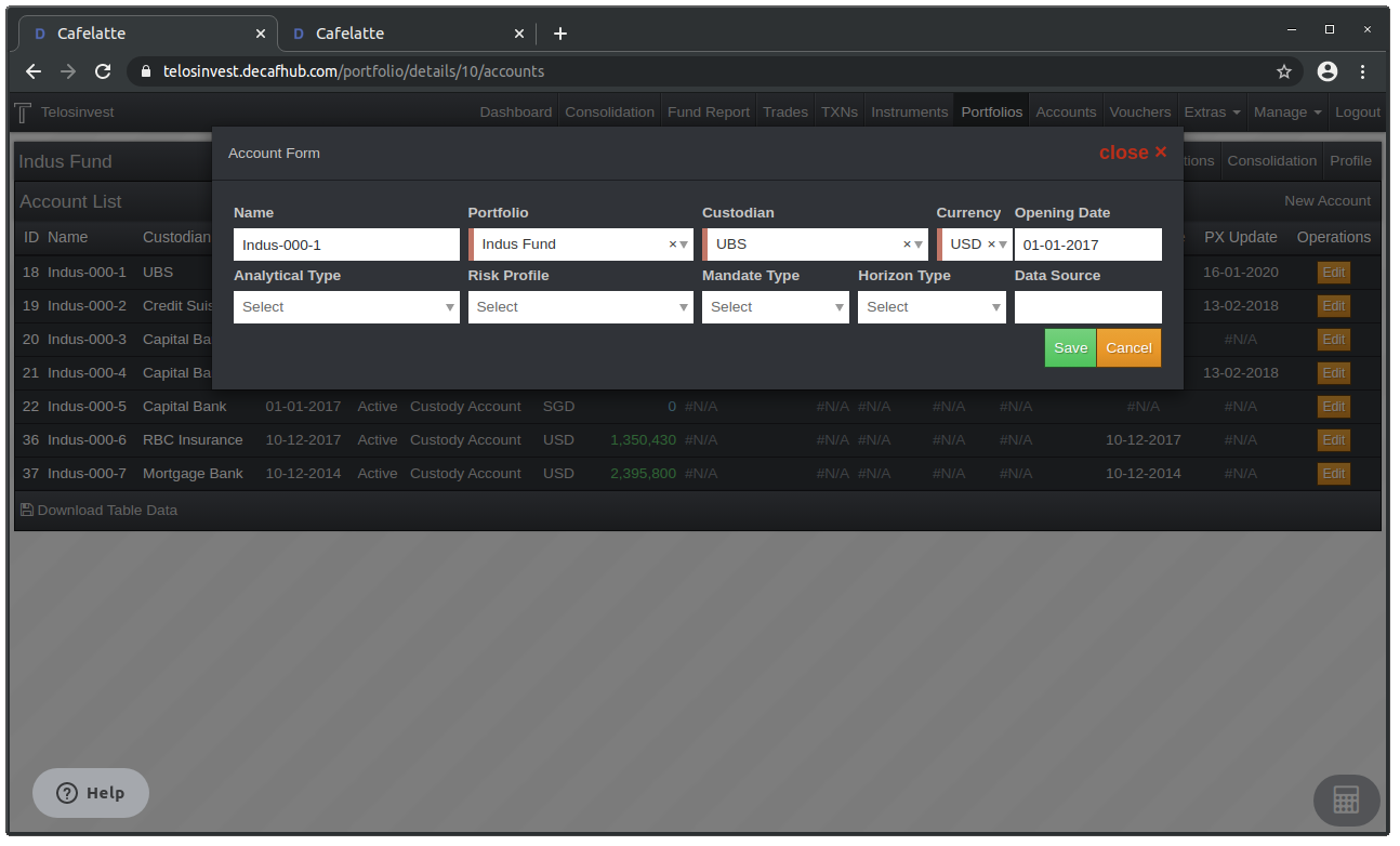
Portfolio Details Account Profile Form (After):
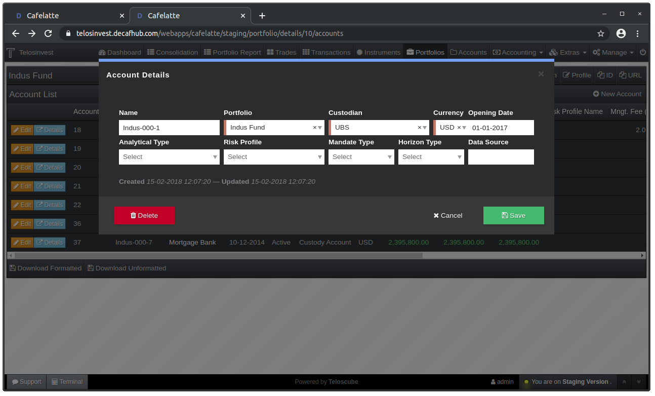
Account List and Details Pages Improvements
Accounts List (Before):
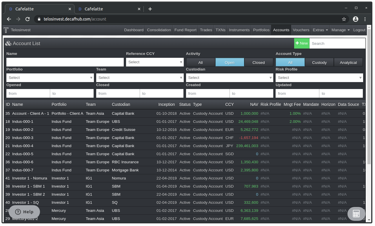
Accounts List (After):
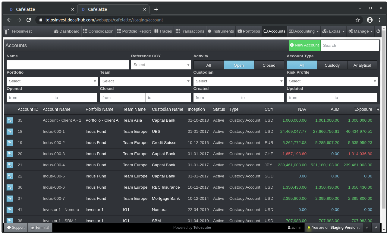
Account Details (Before):
Everything in One Page
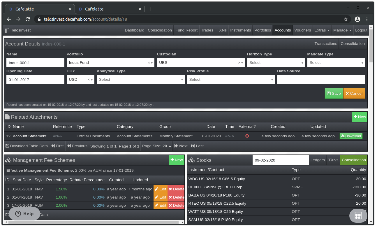
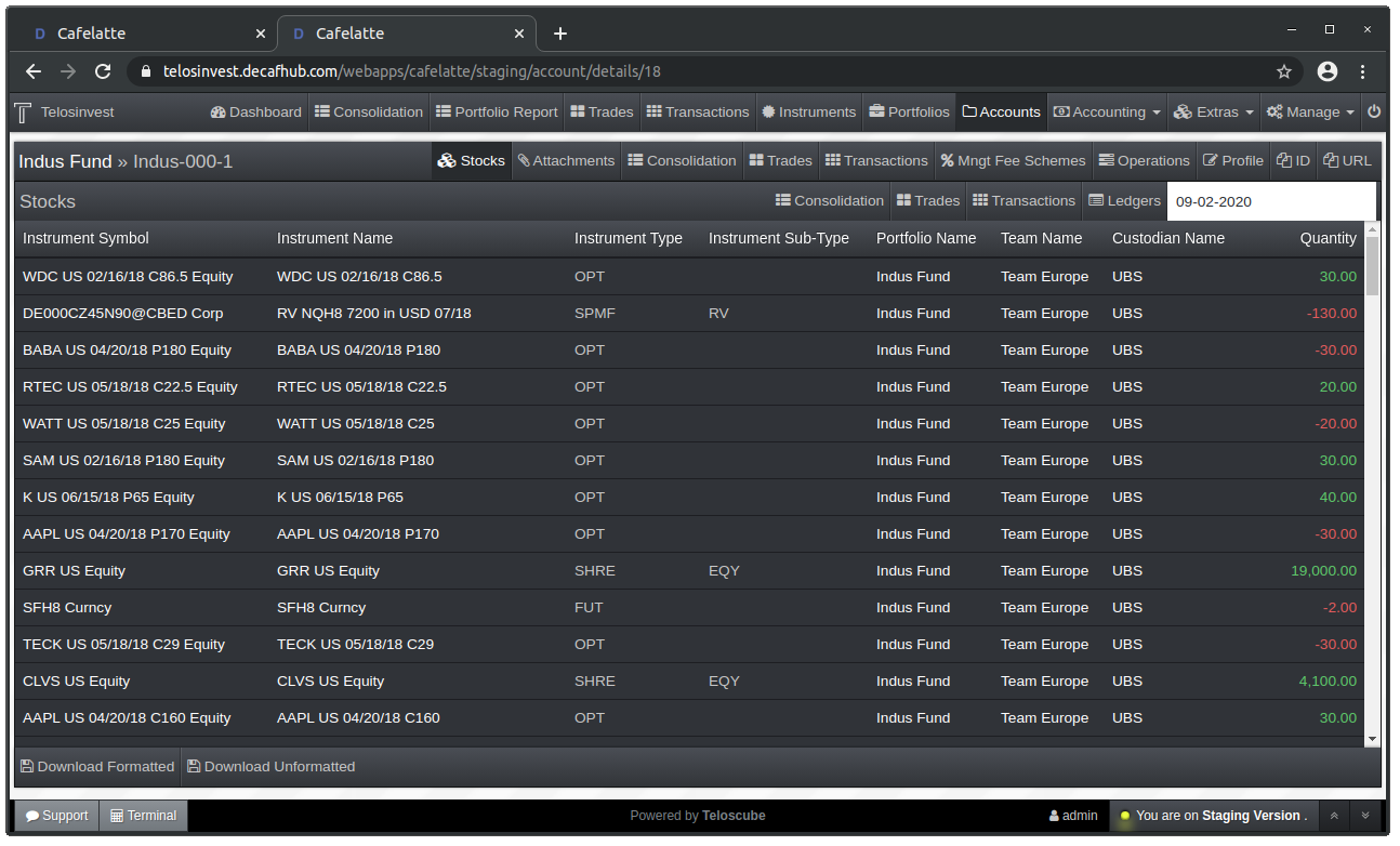
Account Details and Functions (After):
Account Stocks
Account Attachments List
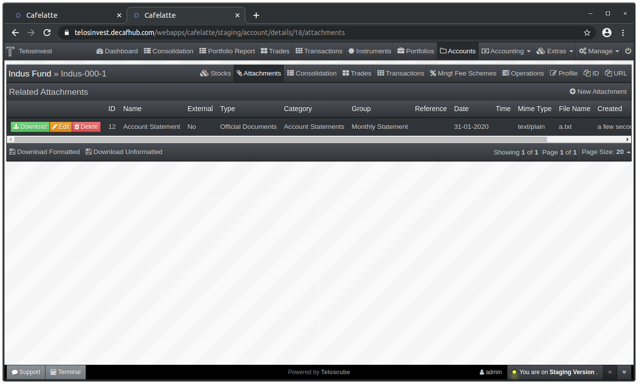
Account Attachments Form
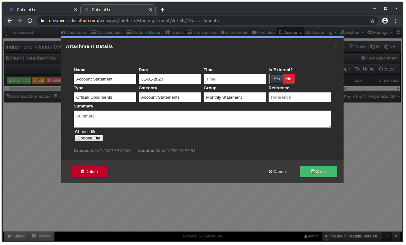
Account Management Fee Schemes List
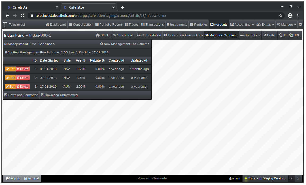
Account Management Fee Schemes Form
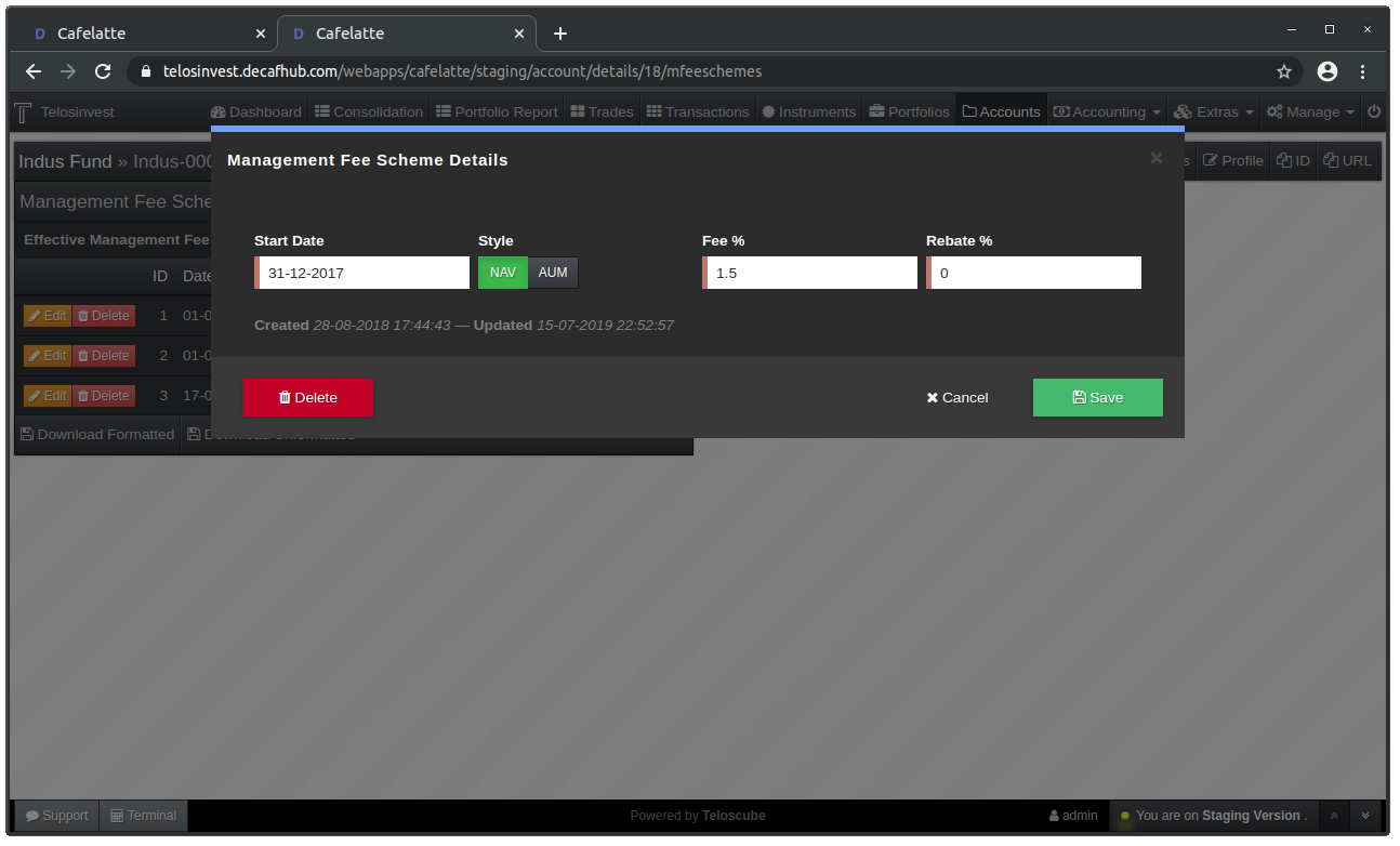
Account Operations
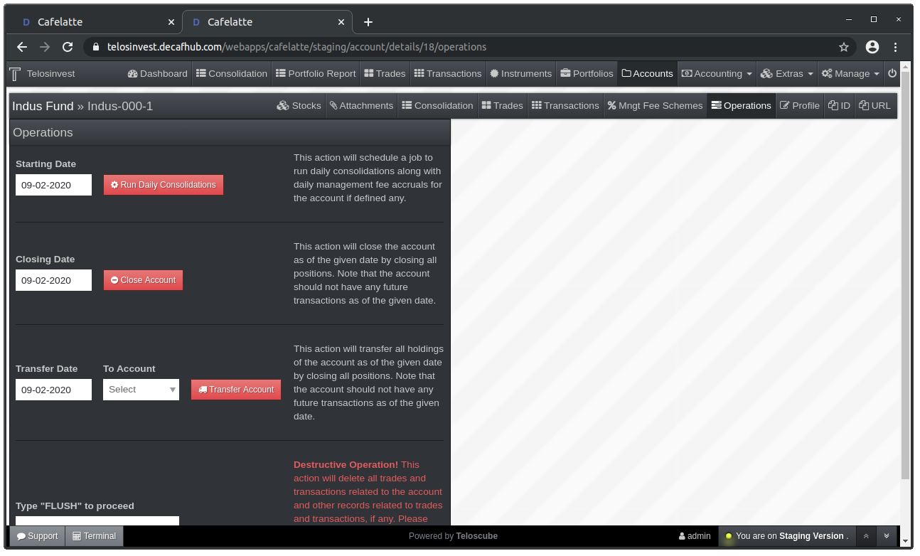
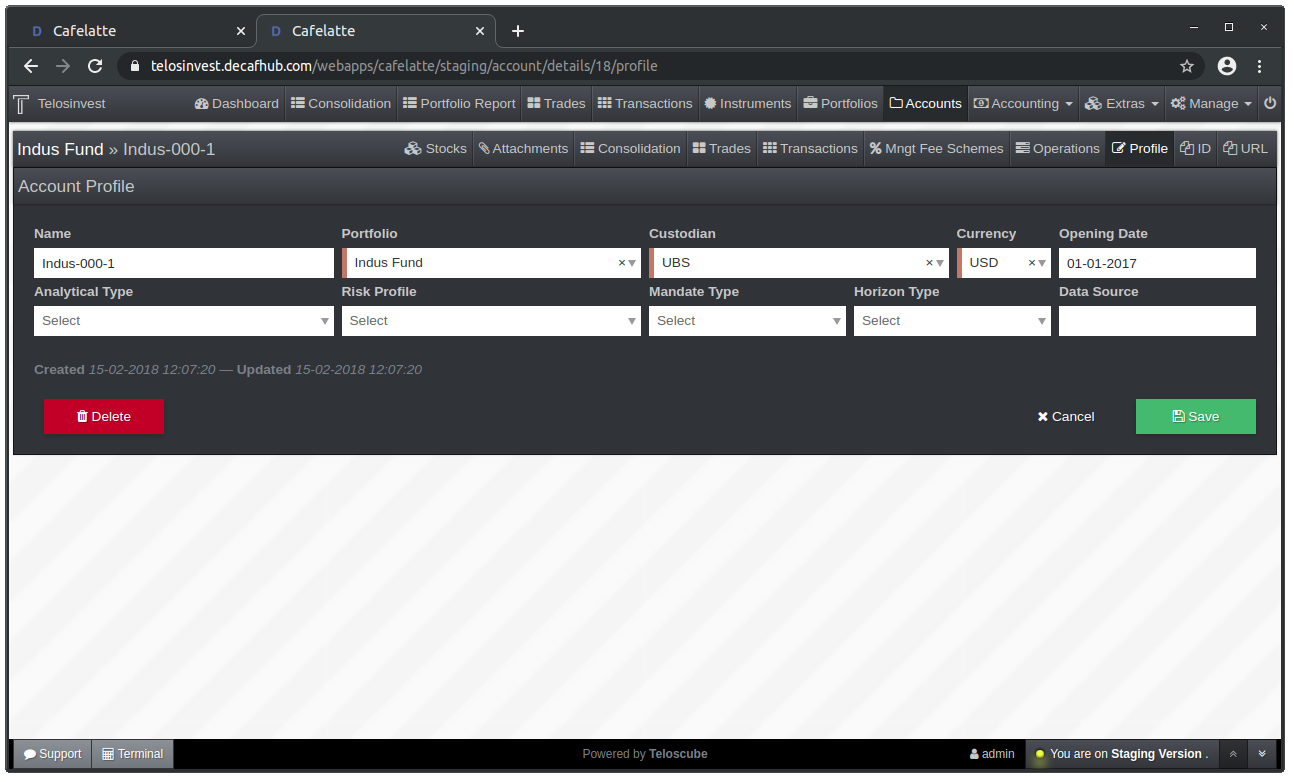
Account Profile Form
Benchmark Field on Share Classes
Share classes now has a new field for specifying the benchmark.
In some cases, share classes have their own benchmarks other than the benchmark of the fund. This benchmark is a relation to an existing OHLC (Price) series.
Use External Valuations During Performance Calculation
Users can opt-in to use external valuations during performance calculations. If the users requests this, external valuations are overlayed on top of portfolio and/or share-class performance series. This increases the control over performance figures which are backed by fund administrator's valuation or custodian statements.
Returns Grid Improvements
Returns grid reports total returns which are calculated for different time periods.
We used to compute first the return series for the entire date span which covers all time periods and then slice return series for each time period to compute total returns for a given time period.
However, there are corner cases because of irregular, sparse price data for instruments which lack significant amount of price observations for a given time period.
Therefore, we now create a big level series which covers all time periods and then attempt to compute each return series and total returns separately for each time period.